1. Flag Grades
Each flag's final mark is based on my judgement of the flag's overall aesthetic value. I initially assigned letter grades, then numeric grades to reflect each flag's position within its grade. The letter grades range from A+ to D-, and F. There are distinct C-, and D+, D- grades. Anything lower than a C- is a fail: that country would be better off without a flag at all. The highest failing numeric grade is fixed at 49%.
I assigned the letter grades in the way I usually mark student papers. C would be assigned to flags that were just satisfactory, but seriously flawed in some way; B to strong attempts with minor flaws; and A to inspired or advanced work. I calibrated this scale by choosing some paradigm examples of flags whose grades I was, at the outset, very sure of:
| For A grades, the Vietnamese flag: | 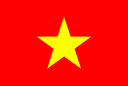 |
| For B grades, the Italian flag: |  |
| For C grades, the Australian flag: |  |
| For D grades, the Fijian flag: |  |
To recieve an F, a flag had to be so awful that its level of badness was clearly qualitatively different from that of any flag receiving a D. I had to feel that a country receiving an F had really set out to create a genuinely horrible flag, or didn't really know what a flag was. One prominent vexillologist I consulted put it thus: "Some countries' flags look like tea towels. If you'd rather be using the flag as a tea towel, and your tea towel as the flag, give it an F."
In the end, only three countries received such a distinction, all U.S. territories (hence my suspicions about the US using its security council veto to block the bringing of bad flag designers to justice). Of these, I wouldn't even trust the Northern Mariana Islands flag to clean my cutlery - it's probably not colourfast.
2. Criteria
After a quick survey of outstandingly good and bad flags, I was able to come up with some basic rules or advice to countries designing flags.
Rule 1: Do not write the name of your country on your flag.
This just seemed obvious to me. Nevertheless, there are some countries that will flout it (like Guam), and they need to be severely punished. Perhaps they think that their citizens might forget the name of their country.
This rule turns out to be difficult to police because of the silly things that countries like Rwanda and the U.S. Virgin Islands will do to get around it. And there a deeper problem of unoriginality here. It's just wrong to have writing on your flag. It subverts the ideals of flag design. Hence:
Rule 1a: Do not write on your flag.
I also felt that I ought to pick out some types of written things on flags for special punishment, besides the name of the country.
Rule 1b: Do not write some stupid slogan on your flag.
British colonies and former colonies love putting widdly little coats of arms on their flags with Latin slogans like 'et cetera' and 'Caecilius est in horto' on them (e.g. Cayman Islands, British Virgin Islands). This is because junior civil servants in the Crown Office of Naming Other People's Countries want to show off how valuable their Etonian education is.
Even this is not the worst. Some British civil servants do not even have an Etonian education. Thus:
Rule 1c: If you must write a stupid slogan on your flag, do not do so in a living language!
Violations of rule 1c leads to horrors such as the flag of the Falkland Islands. Brazil also deserve mention for awfulness in this regard (though I cannot begin to do justice to the badness of their flag at this early stage).
Rule 2: Do not put a map of your country on your flag.
When someone is travelling around your country, where do you think they will look if they need a map?
Bzzt! No, they won't look at the flag. Especially not if it has such a bad colour scheme as Cyprus's. Quite apart from the total uselessness of having a map on your flag, it really shows that a country hasn't gone to any effort if that's the best they can think of. I mean, if we just let people put maps on their flags, everyone could do that, and then there wouldn't be any need for any design effort to go into flags.
Actually, to generalise this rule a little, you can't just put pictures of things on flags. It looks wrong. Flags are supposed to be iconic. They're a shrine to the national spirit, not a tourist brochure. Accordingly:
Rule 2a: Do not put a picture of anything on your flag.
That's right: no pictures. Especially not of sheep (are you listening, Falkland Islands?) or parrots (this means you, Dominica!). Stylised logos based on representations are OK (Albania is pushing it) but representational art is out.
Rule 3: Do not use a tricolour unless you are in Europe.
Actually there is no excuse for any country to use a tricolour - but some places (e.g. France, Italy) are stuck with them and couldn't really change now. The real problem with tricolours is not that they are bad flags - some are quite good - it's just that they are a hang over from a time when fewer countries had flags and tricolour space wasn't so crowded. These days no-one should be using a tricolour if they can avoid it. It's not that tricolours are bad per se; people should just know better than to start using one after say, 1900.
Africa is particularly full of awful tricolours. What makes them particularly bad is that they are all the same colours: that red yellow green thing. Why aren't countries just embarrassed by the fact that their flag is the same as their neighbours, except backwards, upside down, or with a big green star on it? Rwanda deserves special mention for unbelievable unoriginality in this field.
Eastern Europe is also a bad case. Many of the states there had a chance to change their flags when they were all busy seceding from each other, and the best they could do was go back to these horrible tricolours. Probably the reason their neighbours annexed them in the first place was that they couldn't stand to see such vomitous colours just over the border in Armenia, Lithuania, or Bulgaria.
3. Special Codes
As well as assigning letter grades, I also assigned each flag a set of codes corresponding to common failings, or particularly good understanding of what it takes to make a good flag. These are listed below:
Graven Images |
Violations of rule 2a. |
Eyewatering |
This flag caused my eyes to water. Often in virtue of a particularly bad combination of colours, though the most notably eyewatering flags, those of Greenland and Greece, manage to achieve their effect with only two colours. |
Makes me nauseous |
This flag caused me to feel like vomiting (or in some cases, to vomit). Again, often caused by bad colours. Though perhaps Paul's apricot, chocolate and coconut biscuits were to blame. |
Writing! |
Don't write on the flag! Violations of rule 1a. |
Colonial Nonsense |
Used for countries that have the flags of their colonial masters as a part of their flag. The colonial master in question is nearly always the UK, but that's just because French territories all use the French flag, and US external territories all use something the local military commander has created using Microsoft Frontpage. |
Corporate Logo |
This flag looks like a corporate logo. Many attempts at "modern" looking flags fall into this trap, notably Saint Lucia, which induced in me a strange desire to seek financial advice from the inhabitants of this fledgling Caribbean nation. Probably this is counterproductive, as they are mostly employed in the corrugated cardboard box assembly industry. |
Maps! |
Don't put a map on the flag! Violations of rule 2. |
Bad Shape |
The safest shape for a flag is a golden rectangle. Some people can get away with a 2:1 rectangle (it doesn't make the New Zealand flag any worse than it would be otherwise, for example) but others can't, especially when the flag has horizontal stripes on it (like Yugoslavia's, for example). I've used this code when country's departure from the golden rectangle formula makes their flag worse, or when they are just being silly (like Nepal) |
Good Shape |
Occasionally, a flag is improved by being not a golden rectangle. Very occasionally. |
Bad Colours |
Used either if a flag's colours are just intrinsically ugly (like Georgia's), or if they clash horribly (like Niue's). |
Good Colours |
Used where a country has made a particularly good choice of colours - either original or aesthetically pleasing - for their flag. |
Hideous Colours |
I quickly found that by handing out "Bad Colours" every time a flag contained colours that fell short of reasonable standards, I had deflated its meaning so that it could no longer fully express the horror and sickness I felt in seeing flags such as that of Aruba. Accordingly, where a flag's designers appear to have been entirely colourblind and filled with anger and hatred towards those of us able to see the colours of their flag, I have awarded this code. |
Too busy |
Flags should have simple, iconic designs. I have marked flags with this code where they conspicuously fall short of that goal. There are many different ways in which this can happen. One is where countries get involved in drawing fiddily little pictures on their flag, in violation of rule 2a. The other is the kind of "more is better" mentality best typified by Mauritius and Central African Republic. |
Simple |
Awarded for simple but effective designs. |
Plagiarism |
Awarded to flags that are obviously stolen from someone else, (and added a big R in the middle - I am not fooled, Rwanda). I'm not sure whether it's worse to just have basically the same flag as your neighbours (Ecuador and Colombia) or to rip off someone from across the world and try to hide the fact by changing the colours (Norfolk Island's clever, ah, paraphrase, of Canada's flag). |
Original |
Extra points for originality. Not always a good thing. |
Weapons |
If you are going to put a picture on your flag (in violation of rule 2a) why would you put pictures of the weapons that you are using to conduct a bloody repression of your citizens on it? This just doesn't make sense to me. Obviously countries like Afghanistan and Mozambique just aren't interested in the tourist dollars that you can get from not advertising the fact that you like to hack off the limbs of foreigners before shooting them and turning them into soap. Still, it's their loss. |
Bad Tricolour |
Violations of rule 3. |
Too many stars |
Everyone loves stars. Even me. That's why Viet Nam gets such a high grade. Some people, however, are under the mistaken impression that if one star is good, then fifty must be just right. I'm not sure if its worse if the stars are all just piled together, as on the United States flag, or if they are are supposed to be in some special arrangement (as in Tuvalu and Australia). |
4. Resources
I made the initial gradings using the Times Atlas of the World. For the online version of the gradings, I used the flags from Flags of the World, a fine internet resource that I heartily recommend. The CIA world factbook was also helpful, though the CIA, as well as installing bugging devices in my teeth, use their own two letter country codes instead of ISO3166-1, thereby making their site less useful than it might be.